
Heights Sans: Type for a Cause
A one of a kind chromatic woodcut typeface, created in cooperation with Jason Rigg and Taylor Watt. Creating a typeface that visually ties to the call to action posters printed regarding affordable housing in Bozeman. Inspired by the art deco fonts being slapped onto expensive, quickly built new development locally, Heights Sans ironically uses its form to call attention to the how these new builds impact the housing crisis


Building A Typeset (and System)
Using the word "RAW" to construct the majority of our letters, we were inspired by the Fat Face Hamilton Wood Type, and saw how its wide stems and counters would allow room for other geometric forms to be constructed within. Once we had finalized the forms, we formatted them to be laser cut onto matte board for later construction.
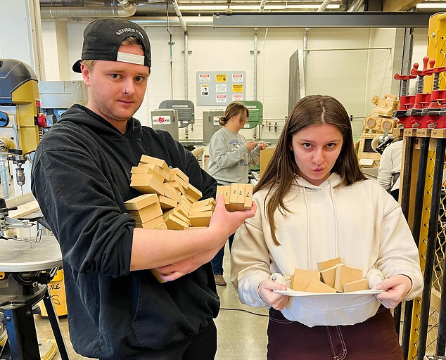
Building A Typeset (literally)
We cut out A LOT of board to ensure our laser-cut letters would be press height for print, then set all of letters using a box system for placement, wood glue and a metal screw press for overall assembly. Jason and Taylor are pictured on the right carrying our boards, and Jason is pictured below checking the type height.


Final Font

